Software ecology encompasses the study and practice of enhancing software sustainability, focusing on longevity, maintainability, and adaptability. Sustainable software is crucial for both research and commercial endeavours, as it ensures relevance over time. However, many developers may lack awareness of sustainability principles or how to implement them effectively.
Addressing this gap requires a solution that educates developers on best practices while aiding software ecology researchers in analysing larger projects. This report delves into the fundamentals of software ecology and its significance for developers. It proposes a solution to achieve sustainability goals while narrating the journey of developing this solution. Supplementing this report is an exploration of a prototype app designed to assist software ecology researchers and engage developers in sustaining software.
What is Software Ecology?
Software ecology examines the interconnectedness of software systems within a broader environmental context. To conduct a software ecology analysis of a project, one must assess various metrics such as productivity, presence through issues and feedback, the use of comprehensive technical documentation, software practices and more. By examining these factors, researchers can gain insights into the project’s development dynamics, community interactions, and overall sustainability within the software ecosystem.
To address these challenges, a solution is imperative to foster sustainable software development practices, educate developers on their importance, and democratize the field of software ecology. A proposed solution involves an application akin to GitHub Insights, gathering project data from GitHub’s database and presenting it in user-friendly formats. This tool aims to facilitate project analysis, history exploration, contributor identification, and more.
Additionally, this project serves as an opportunity for personal skill development in software ecology. By concurrently engaging in research, experimentation, design, and implementation phases, it aims to enhance not only software sustainability but also the creator’s proficiency in the domain.
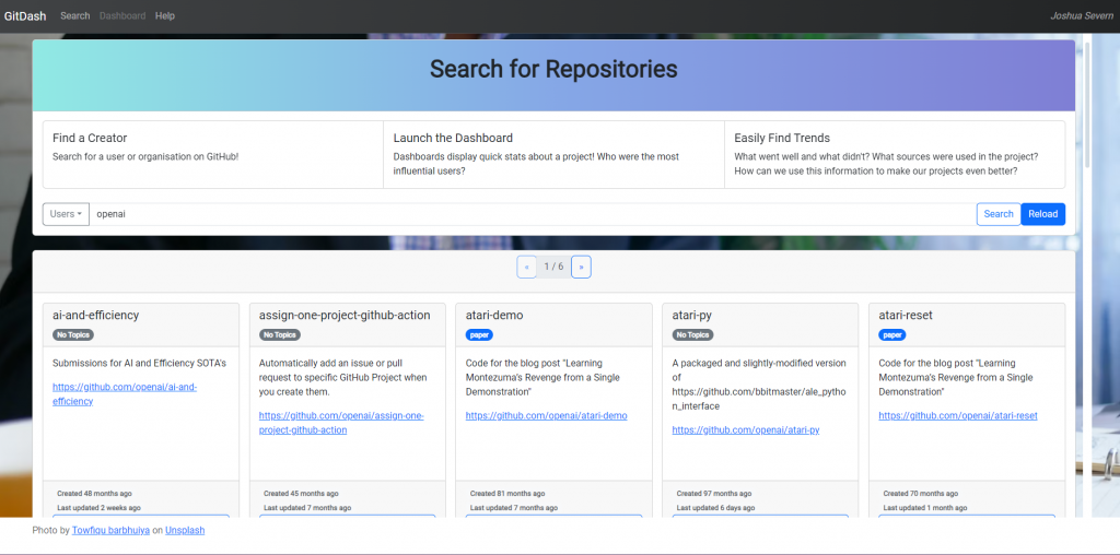
Search view
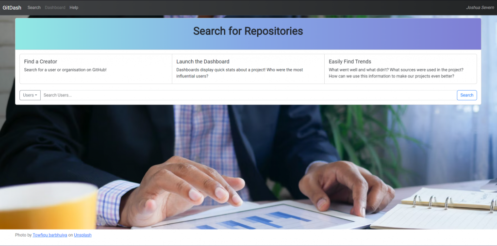
The Search View serves as the entry point for users into the app, functioning akin to a “title screen” by providing a brief overview of the app’s purpose and functionality. Users can enter a GitHub username in the search bar, with the option to switch to organization names via the tab on the left. Upon submission, the search results display a list of repositories owned by the specified user or organization. Repositories are listed alphabetically for easy navigation.

Alternatively, users can directly access a specific project’s dashboard by entering any valid endpoint in the format “/dashboard/{username}/{repository name}”. This routing technique not only facilitates the opening of dashboards for individual projects but also offers users a convenient method to quickly access any desired project.
Dashboard view
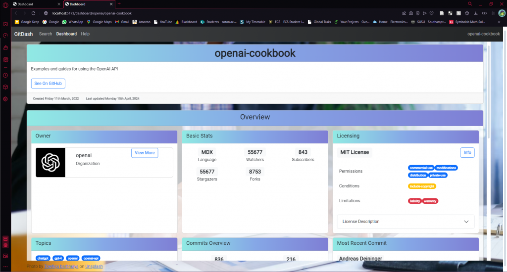
The Dashboard View serves as the central area of the web app, offering users both a quick overview of a project and the ability to delve deeper into its history.
Main Title
At the top, users encounter the project’s title, description, creation date, and last updated date. Particularly crucial for researchers, these dates are formatted to display time elapsed since the last update, providing insights into the project’s maintenance status.
Cards
The dashboard showcases multiple adaptable cards, ensuring compatibility across various screen sizes, from desktop to mobile web browsers.
User Card
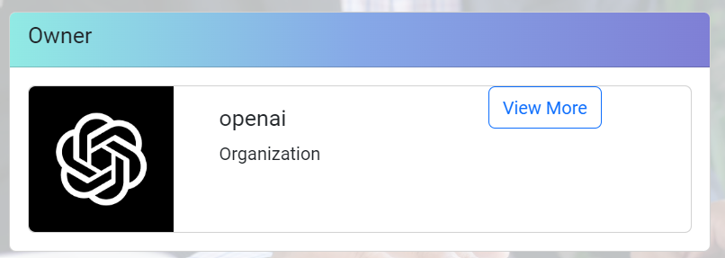
The first card presents a User Card featuring the repository owner’s details, along with any affiliated organization. An embedded link in the user’s image directs users to their GitHub profile page, while another link opens the User View offcanvas. This dual-link approach ensures users have the flexibility to access both the user’s GitHub profile and detailed contributions.
Stats Card
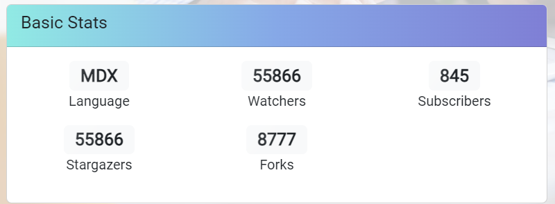
The following card, Basic Stats, provides essential statistics about the project. “Watchers” indicate users who receive notifications about repository activity, while “subscribers” focus on those interested in specific issues or pull requests. “Stargazers” signify users who have “starred” the repository, serving as a popularity indicator and bookmark. Additionally, the count of project forks reflects the number of repository copies, indicating community engagement and potential for collaboration.
Topics
Displayed next are repository topics, crucial for defining a project’s purpose, community, or language. Topics aid in categorizing projects and facilitating users’ exploration of similar repositories.

License
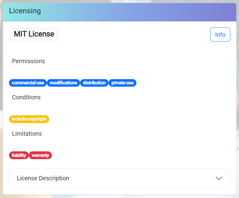
Information regarding the repository’s license follows. Software licenses delineate usage rights and restrictions, ensuring clarity about what users can and cannot do with the project’s source code.
Cited Resources
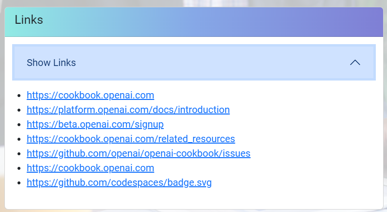
Finally, the dashboard includes a list of cited resources from the repository, particularly crucial for research projects referencing journals or scientific papers. This list is extracted from the project’s “README” file, ensuring easy access to referenced materials directly from the dashboard. Additionally, any other links included in the repository’s “README” file are conveniently displayed within this card, enhancing user accessibility.
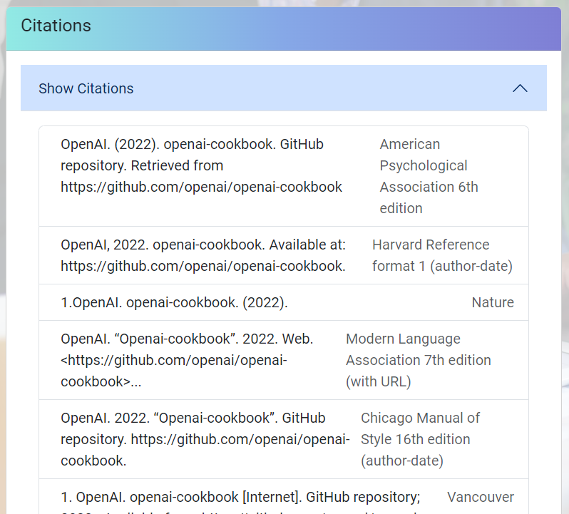
In addition to compiling citations for publications, the Cite Repository card features a dropdown menu showcasing common citation formats, aiding researchers in citing the repository in their articles or reports. This functionality leverages the CiteAS API, providing users with accurate citations in multiple citation styles. It’s a convenient and efficient method for obtaining correct citations for research products, including GitHub projects.
User View Offcanvas
Selecting the button adjacent to a User Card reveals an offcanvas panel presenting additional information about the user. This panel includes the user’s profile details, contact links, and a list of projects they own that share similarities with the current one. By leveraging topics for comparison, this feature enhances users’ exploration of the app, facilitating connections between similar projects.
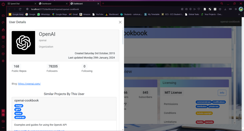
Placing the User View in an offcanvas component rather than grouping it with the dashboard’s main cards helps maintain a clutter-free interface, ensuring users can explore users at their own pace without distractions.
Activity Chart
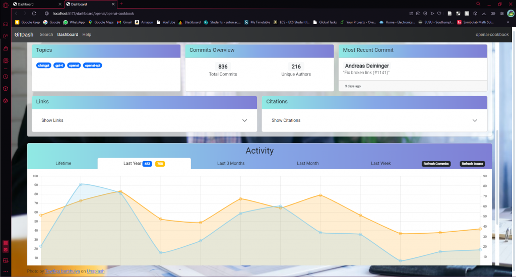
Initially designed to display a project’s commits over its lifetime, the Activity Chart has evolved significantly. Users can now select different time windows for the project, ranging from Lifetime to Last Week, enabling them to track long-term and recent activity trends easily.
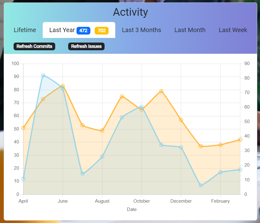
Additionally, the chart has been integrated with a similar Issues chart to consolidate information and allow users to compare project contributions with discussion levels.
While the Activity Chart primarily focuses on commit data, a separate card provides details on the total number of commits and the most recent commit received by the project. This chart allows users to observe activity spikes and trends, facilitating deeper insights into project dynamics.
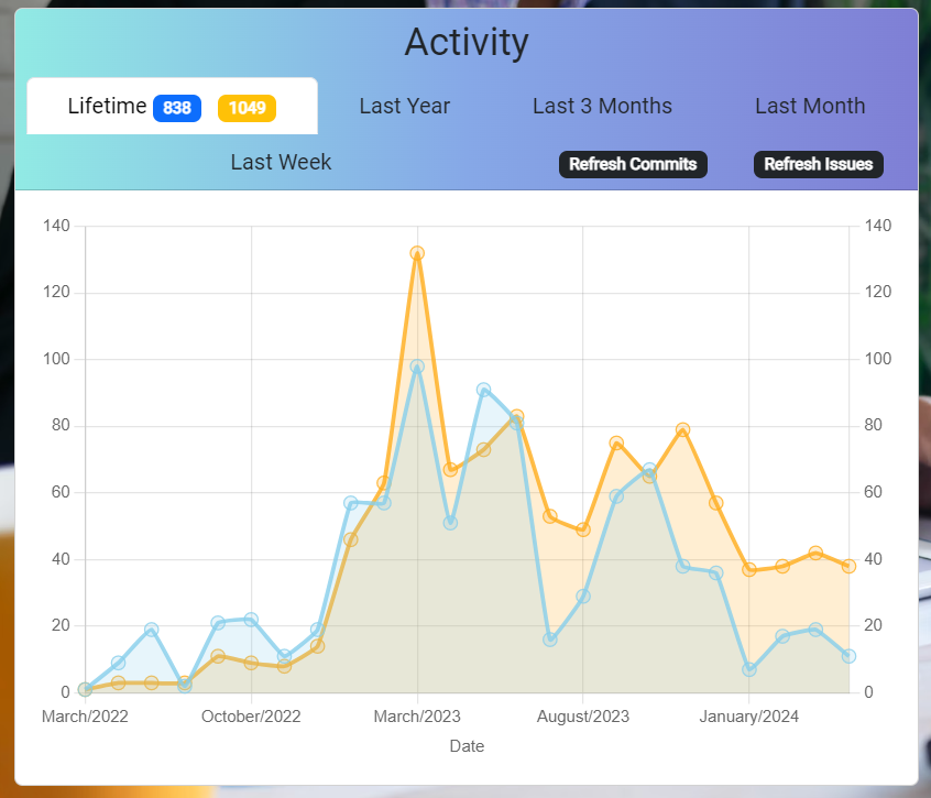
For instance, in the provided chart, users can observe a spike in activity for this OpenAI project during early 2023, coinciding with heightened global interest in OpenAI initiatives. However, upon shifting focus to the end of the chart and selecting the Last Month option, users can discern a gradual decline in activity. This dynamic visualization enables users to track fluctuations in project engagement over time, offering valuable insights into its development trajectory.
Contributor Chart
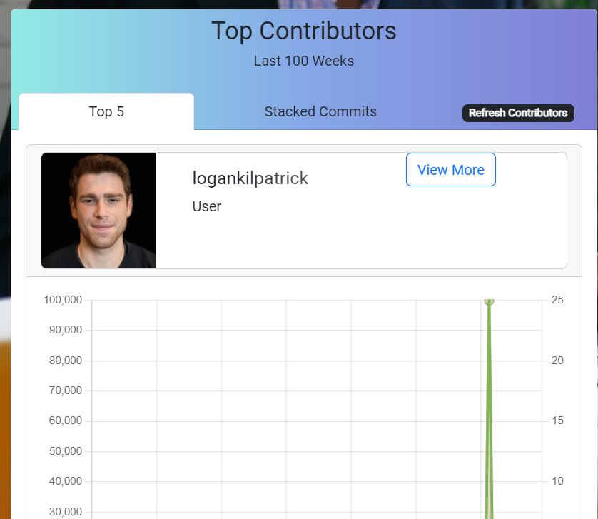
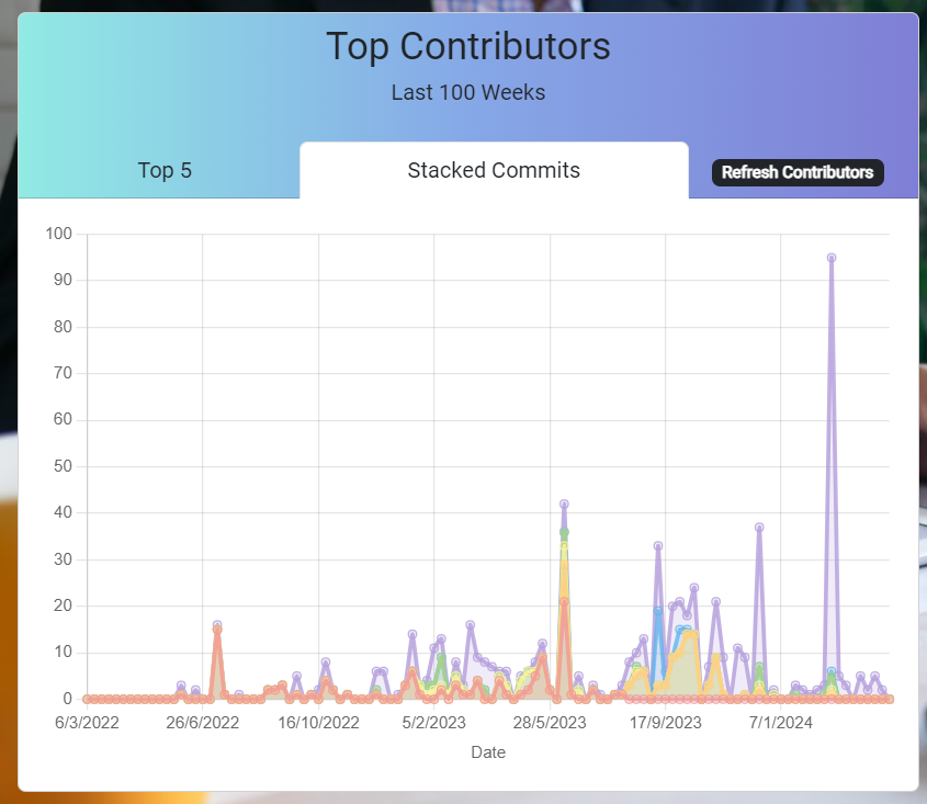
Located beneath the Activity Chart, the Contributor Chart highlights the top contributors to a project. The card offers two modes: the first mode presents individual charts for the top 5 contributors, showcasing additions, deletions, and commits made in the last 100 weeks. This mode emphasizes the significance of commit size when analysing contributors’ impact.
The second mode features a stacked line chart displaying the commits of the top 5 contributors alongside those of other contributors. This visualization aids in comparing productivity distribution within the project, providing insights into the project’s development dynamics.
Help View
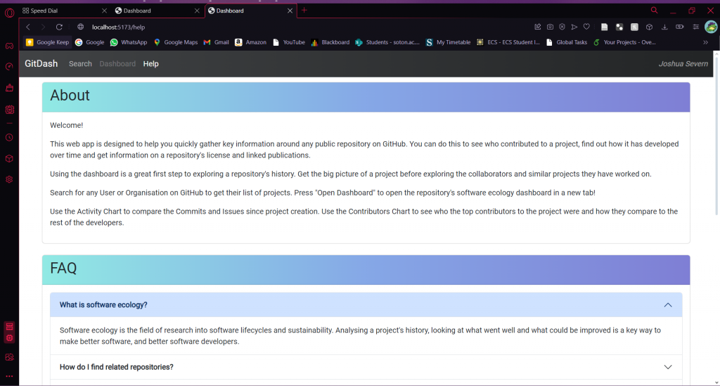
While the dashboard interface strives for intuitive design and robust functionality, a brief help section is provided within the app to assist users in case of unexpected occurrences or uncertainty about operations. This section includes Frequently Asked Questions addressing common issues encountered with the app. For instance, users may experience data response delays due to poor internet connections or high traffic on GitHub servers. In such cases, refreshing the web browser is recommended, serving as a reliable troubleshooting method commonly employed in web applications.
Behind The Scenes
In a fitting coincidence, the project’s version control and storage were managed on GitHub, aligning seamlessly with the platform’s capabilities. Leveraging GitHub Pages, a static site hosting service, allows the app’s files to run directly from the GitHub repository, offering a free and straightforward deployment solution that integrates seamlessly with Vite building.
Requests for data from the GitHub API are facilitated using Octokit [https://github.com/octokit/octokit.js], a powerful toolkit for interacting with GitHub’s API. When retrieving substantial amounts of data, such as a project’s commit history, issue history, or a user’s list of repositories, a pagination function ensures efficient data retrieval. Octokit offers various shorthand methods for accessing GitHub data, with URIs typically starting with “api.github.com” for connectivity. For other APIs, such as fetching from CiteAS, the built-in “fetch” library is utilized. To mitigate potential issues like response failure or exceeding API rate limits, requests are configured with timeouts and delays between each request.
The Chart.js library powers the creation of charts, with added functionality for enhanced responsiveness. A pop-up displays exact values when hovering over specific points on the chart, aiding users in precise data interpretation. Moreover, to streamline user experience, pop-ups trigger only near valid data points, eliminating clutter caused by zero values. Charts are also stylized with different colors, line smoothing, and animations for smoother transitions between chart states.
To safeguard authentication details, the token is stored locally in an environment variable file “.env.” During deployment, the token is transferred to GitHub Secrets [https://docs.github.com/en/actions/security-guides/using-secrets-in-github-actions], a secure area hidden from viewers but accessible for GitHub Actions workflows. The “.env” file remains local and is not pushed to the server hosting the app (GitHub Pages), ensuring the authentication token’s confidentiality is maintained solely by the app developer.
Reviewing
When designing the dashboard, a common concern among colleagues was to avoid inundating users with too much text. I agreed; a dashboard filled with statistics alone lacks intrigue and may deter users from exploring further. To address this, the help text detailing the significance of statistics and instructions on how to use the dashboard were relocated to a separate page. While it was feasible to integrate this information directly into the dashboard, we opted against it to maintain a focused user experience.
However, feedback from early testers prompted the initial addition of the Help View feature, as users encountered issues that could be resolved with a simple refresh but were unsure if it would help. Concurrently, built-in refresh buttons were incorporated for commits, issues, and contributors, acknowledging that these sections contain extensive paginated data where occasional data loss may occur.
Future Improvements
Although the app underwent several months of development from its initial iteration to the final product, there are still areas that could benefit from improvement. Feedback from various testers highlighted some of these areas early in the process. However, due to time constraints, certain requested features were unable to be fully implemented before the project deadline and had to be omitted.
Design Process
Embarking on this project marked a significant departure from typical software development endeavours, particularly those undertaken for coursework. It presented an opportunity to acquire new skills, especially in the realms of cloud app technologies and API integration, which were concurrently learned during the development of the final prototype.
One aspect of the process that could have seen notable improvement is the design phase. While experimentation is invaluable for learning, it often consumes a substantial amount of time. Perhaps a more effective approach would have been to allocate design time to creating simple pen-and-paper sketches of the dashboard UI, soliciting feedback from various stakeholders, and subsequently refining the design based on insights gathered.
Conclusion
In conclusion, analysing software ecology is crucial for understanding the complex interplay between software systems, developers, and the broader technological landscape. By examining metrics such as productivity, community engagement, and technical documentation, researchers can gain valuable insights into a project’s development dynamics and sustainability within the software ecosystem.
The dashboard application developed as part of this project serves as a powerful tool for researchers seeking to analyse the history and evolution of software projects hosted on platforms like GitHub. With features like the user detail panel and activity metrics charts, the dashboard empowers researchers to delve deeper into project data, identify trends, and draw meaningful conclusions about project evolution and community engagement over time.
Through the process of designing and implementing the dashboard application, several important lessons about software development have emerged. The iterative nature of development, the importance of thorough research and planning, and the value of user feedback in shaping the final product are just a few key takeaways.
Overall, the project underscores the importance of continuous learning, adaptation, and collaboration in the ever-evolving field of software development.
If you would like to check out the project files, they are available on my GitHub: https://github.com/Xpload334/js3g21-software-ecology-insights